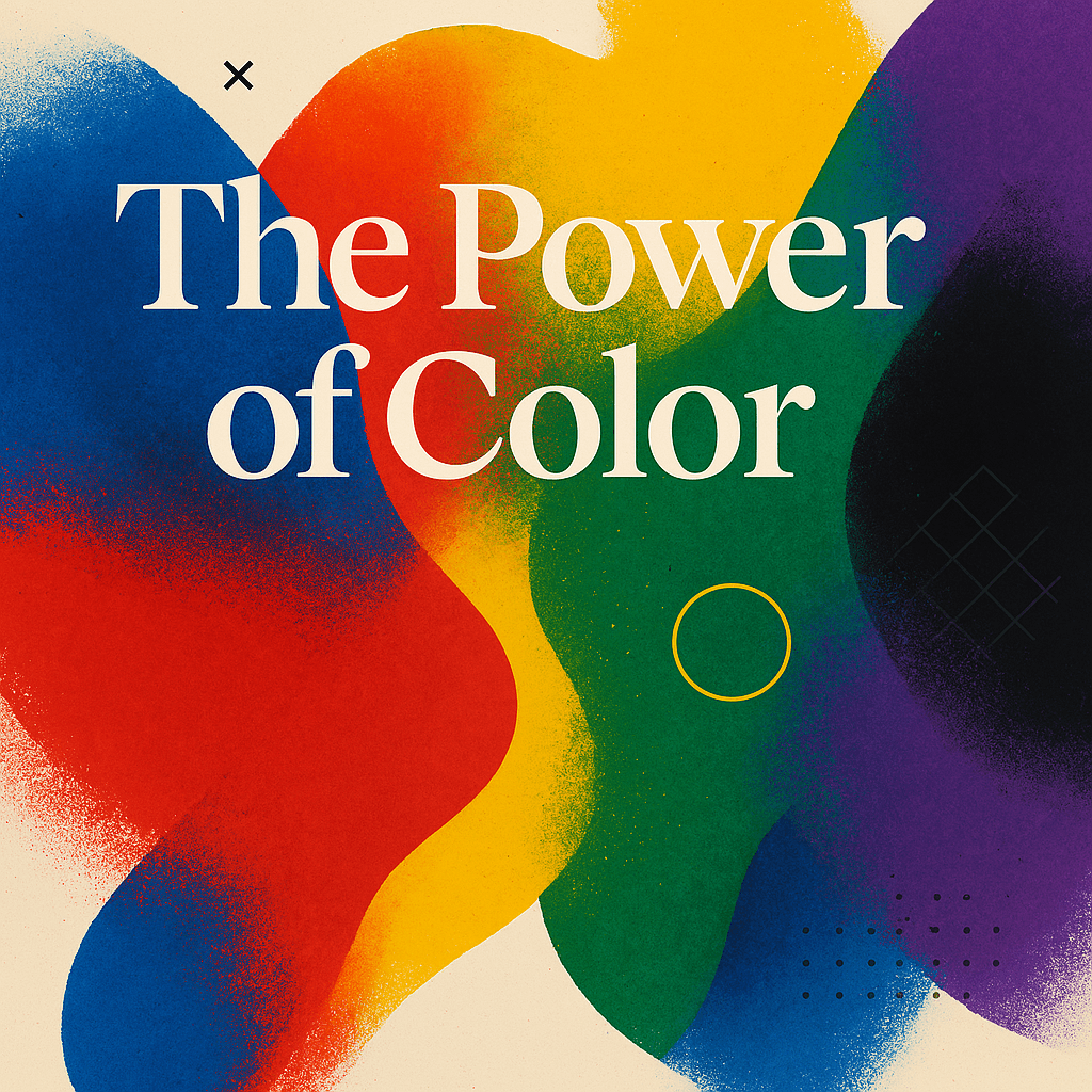
How Creatives Can Use Color Psychology to Make More Money
For Artists
•
Sep 17, 2024
Color isn’t just an aesthetic choice — it’s a strategy.
Whether you're an artist, creator, or brand-building entrepreneur, the colors you use can influence how people feel, what they remember, and whether they buy.
In a crowded digital world where attention is currency, understanding the meaning behind certain colors can help you build trust, trigger action, and make your brand feel right — all of which contribute directly to your bottom line.
Here’s how to use color intentionally to stand out and sell smarter.
Why Color Matters in Business
Color increases brand recognition by up to 80%
Colors influence mood, perception, and purchase intent
The wrong color can dilute your message — the right one can amplify it
For creatives, that means every design choice, from your Instagram grid to your sales page, tells a story. The question is: Are you telling the one that makes people take action?
Blue: Trust, Security, Stability
Use it when: You want to come across as credible, dependable, and calm.
Industries: Finance, tech, wellness, B2B
Best for coaches, consultants, or service-based creatives who want to feel professional and trustworthy.
Money move: Use deeper blues for professionalism (like navy), lighter blues for friendliness (sky or turquoise).
Red: Energy, Passion, Urgency
Use it when: You want attention, emotion, or action — fast.
Industries: Entertainment, fitness, food, fashion
Perfect for launches, sales countdowns, or bold brands with big personality.
Money move: Use red as a call-to-action color to drive conversions — but don’t overdo it, or it can feel aggressive.
Yellow: Optimism, Warmth, Youthfulness
Use it when: You want to energize, uplift, or feel accessible.
Industries: Creative, lifestyle, education, personal brands
Great for creators who want to feel vibrant, friendly, and inviting.
Money move: Use yellow in branding or visuals to stand out in feeds — but balance with grounding neutrals to avoid visual fatigue.
Green: Growth, Balance, Prosperity
Use it when: You want to convey progress, sustainability, or renewal.
Industries: Health, wellness, finance, sustainability
Ideal for educators, mindset coaches, and digital product sellers focused on transformation.
Money move: Dark green implies luxury and stability. Bright green suggests energy and approachability.
Purple: Creativity, Luxury, Transformation
Use it when: You want to feel elevated, artistic, or spiritual.
Industries: Beauty, wellness, tech, art
Perfect for artists, musicians, or creators selling premium experiences or digital products.
Money move: Purple works well in high-end branding and content offers. Use it in accents or headers to draw the eye.
Black: Sophistication, Power, Modernity
Use it when: You want to be bold, minimal, or high-end.
Industries: Fashion, luxury, tech, design
Great for minimalist brands or high-ticket offers that need a sleek edge.
Money move: Pair black with strong typography and gold, white, or red accents for a bold, profitable aesthetic.
Pro Tip: Use Color Intentionally Across Touchpoints
Branding: Your logo, palette, and social visuals
Content: Thumbnails, backgrounds, overlays
Offers: Landing pages, pricing sheets, call-to-action buttons
Storytelling: Use color to evoke mood in visuals or short-form video
How Color Can Help You Sell More
Creates emotional alignment — people buy when it feels right
Builds trust faster — aligned colors = perceived professionalism
Improves brand recall — strong color consistency builds recognition
Increases conversions — especially with the right CTA/button colors
Final Thoughts
You don’t need a design degree to use color strategically — just a little awareness and intention. The colors you use are part of your message, and when they’re aligned with your personality, audience, and offer… they sell for you.
Want help designing a color-consistent content system or brand identity that works on autopilot?
👉 Let’s talk. Artlet helps creators and businesses build smart systems that scale — and look damn good doing it.
Related insights


How Creatives Can Use Color Psychology to Make More Money
For Artists
•
Sep 17, 2024
Color isn’t just an aesthetic choice — it’s a strategy.
Whether you're an artist, creator, or brand-building entrepreneur, the colors you use can influence how people feel, what they remember, and whether they buy.
In a crowded digital world where attention is currency, understanding the meaning behind certain colors can help you build trust, trigger action, and make your brand feel right — all of which contribute directly to your bottom line.
Here’s how to use color intentionally to stand out and sell smarter.
Why Color Matters in Business
Color increases brand recognition by up to 80%
Colors influence mood, perception, and purchase intent
The wrong color can dilute your message — the right one can amplify it
For creatives, that means every design choice, from your Instagram grid to your sales page, tells a story. The question is: Are you telling the one that makes people take action?
Blue: Trust, Security, Stability
Use it when: You want to come across as credible, dependable, and calm.
Industries: Finance, tech, wellness, B2B
Best for coaches, consultants, or service-based creatives who want to feel professional and trustworthy.
Money move: Use deeper blues for professionalism (like navy), lighter blues for friendliness (sky or turquoise).
Red: Energy, Passion, Urgency
Use it when: You want attention, emotion, or action — fast.
Industries: Entertainment, fitness, food, fashion
Perfect for launches, sales countdowns, or bold brands with big personality.
Money move: Use red as a call-to-action color to drive conversions — but don’t overdo it, or it can feel aggressive.
Yellow: Optimism, Warmth, Youthfulness
Use it when: You want to energize, uplift, or feel accessible.
Industries: Creative, lifestyle, education, personal brands
Great for creators who want to feel vibrant, friendly, and inviting.
Money move: Use yellow in branding or visuals to stand out in feeds — but balance with grounding neutrals to avoid visual fatigue.
Green: Growth, Balance, Prosperity
Use it when: You want to convey progress, sustainability, or renewal.
Industries: Health, wellness, finance, sustainability
Ideal for educators, mindset coaches, and digital product sellers focused on transformation.
Money move: Dark green implies luxury and stability. Bright green suggests energy and approachability.
Purple: Creativity, Luxury, Transformation
Use it when: You want to feel elevated, artistic, or spiritual.
Industries: Beauty, wellness, tech, art
Perfect for artists, musicians, or creators selling premium experiences or digital products.
Money move: Purple works well in high-end branding and content offers. Use it in accents or headers to draw the eye.
Black: Sophistication, Power, Modernity
Use it when: You want to be bold, minimal, or high-end.
Industries: Fashion, luxury, tech, design
Great for minimalist brands or high-ticket offers that need a sleek edge.
Money move: Pair black with strong typography and gold, white, or red accents for a bold, profitable aesthetic.
Pro Tip: Use Color Intentionally Across Touchpoints
Branding: Your logo, palette, and social visuals
Content: Thumbnails, backgrounds, overlays
Offers: Landing pages, pricing sheets, call-to-action buttons
Storytelling: Use color to evoke mood in visuals or short-form video
How Color Can Help You Sell More
Creates emotional alignment — people buy when it feels right
Builds trust faster — aligned colors = perceived professionalism
Improves brand recall — strong color consistency builds recognition
Increases conversions — especially with the right CTA/button colors
Final Thoughts
You don’t need a design degree to use color strategically — just a little awareness and intention. The colors you use are part of your message, and when they’re aligned with your personality, audience, and offer… they sell for you.
Want help designing a color-consistent content system or brand identity that works on autopilot?
👉 Let’s talk. Artlet helps creators and businesses build smart systems that scale — and look damn good doing it.